Packaging & Label Design
This category highlights packaging and label systems designed for practical retail use.
The work shown here focuses on how products communicate value, function, and brand identity through structure, typography, color systems, and information hierarchy. All projects are designed to work across physical packaging, digital presentations, and future product extensions.
Case Study 01
Island Sipz is a Hawaii-based tropical beverage distributor.
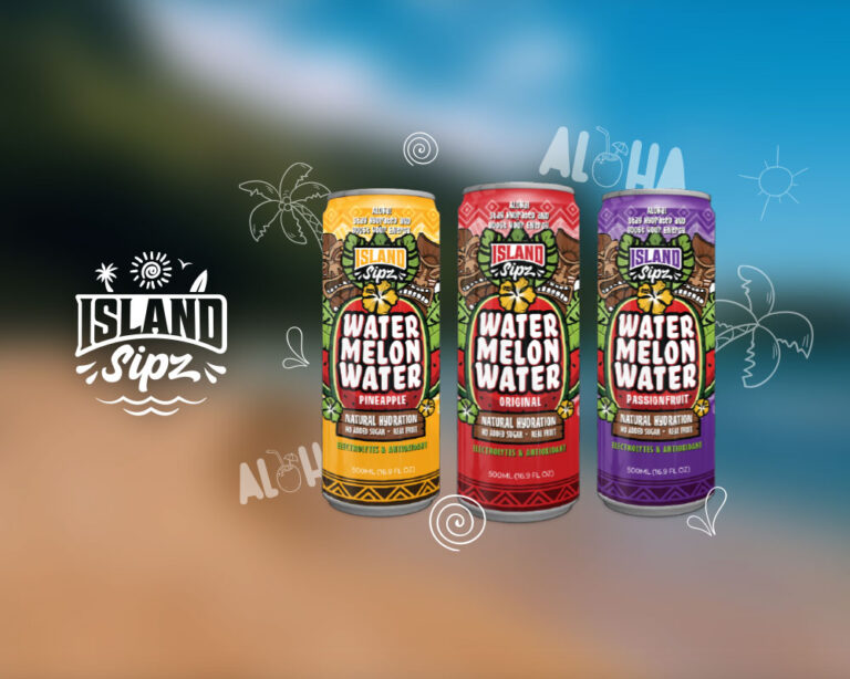
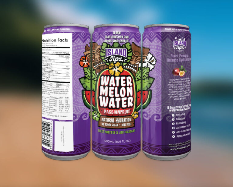
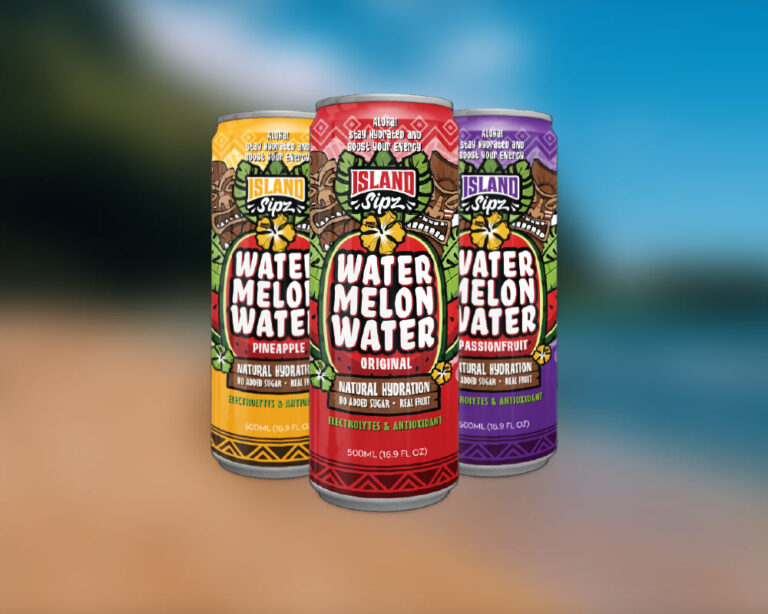
For the launch of their new watermelon water product, I led the complete packaging and brand design, creating a system built for retail distribution and future product expansion.
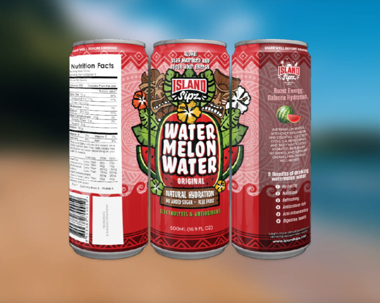
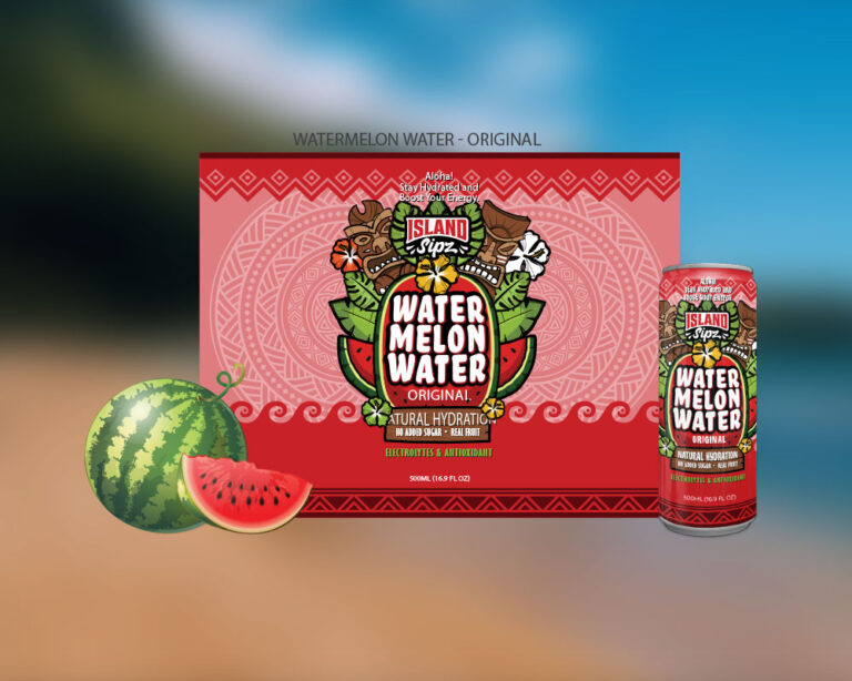
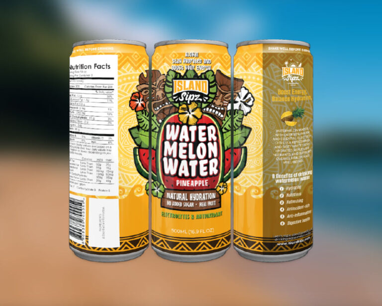
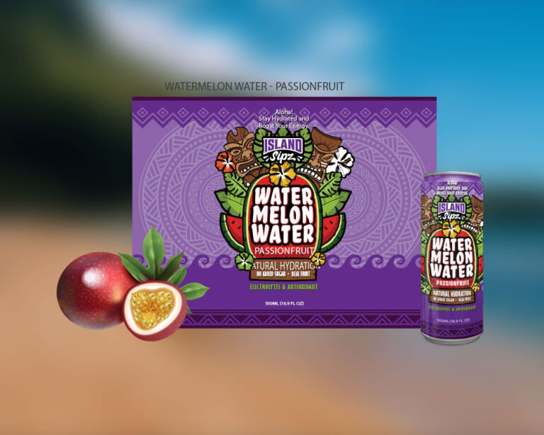
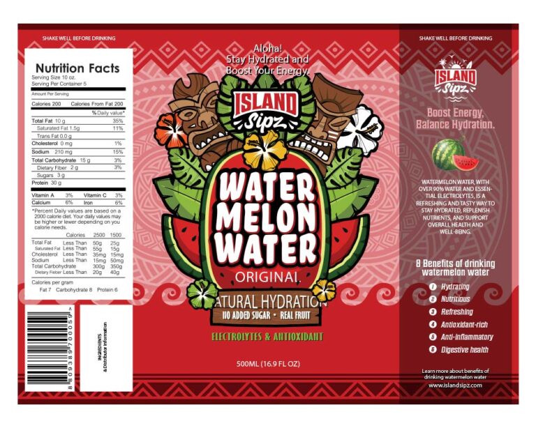
Island Sipz Watermelon Water was designed as a complete packaging system, not a single label. The goal was to introduce a new product line with strong shelf presence while maintaining flexibility for future flavors and formats.
From color hierarchy and typography to flavor differentiation and production-ready layouts, every element was built to work consistently across cans, marketing visuals, and retail environments.
This project reflects a balance between bold visual identity and real-world packaging requirements.
Have a product ready to launch or scale?
Let’s design a packaging system that works in the real world.

Case Study 02
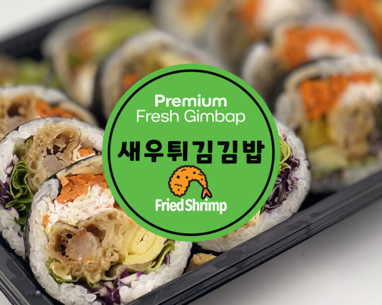
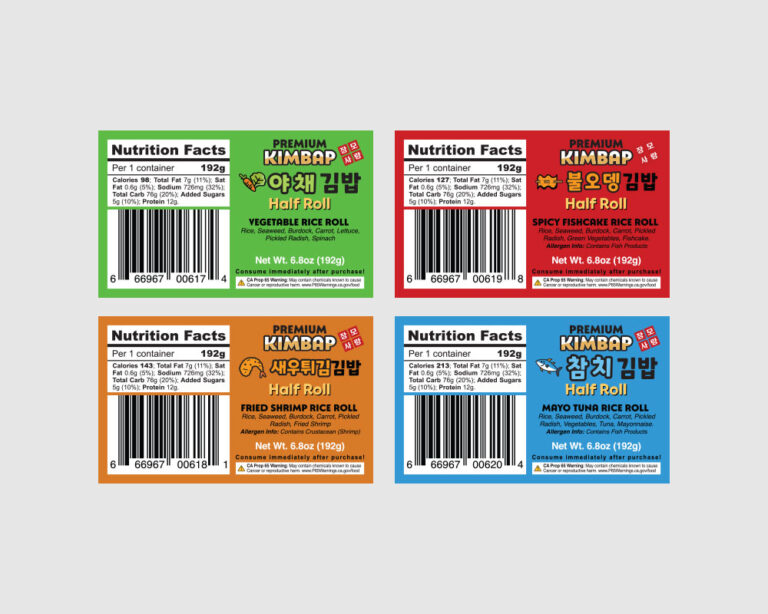
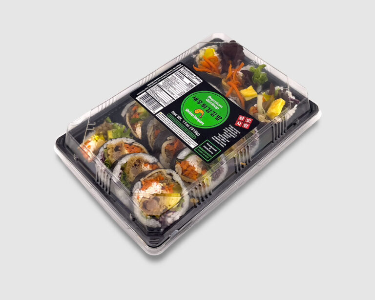
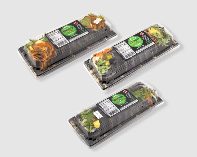
Premium Fresh Kimbap is a daily produced Korean food product distributed through local retail partners.
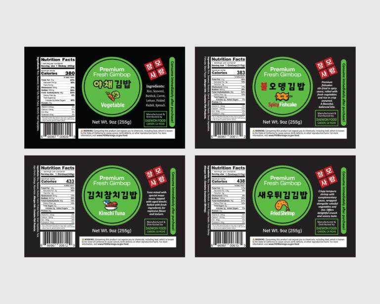
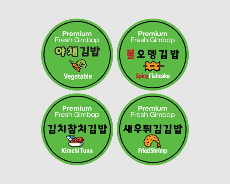
This project focused on designing a practical label system built for freshness, speed, and consistency.
The labels were developed to support frequent production cycles, clear product identification, and reliable application across multiple kimbap varieties.
Rather than treating labels as decoration, the system was designed as a working tool for real food operations.
Key Design Considerations
The result is a label system that works under real conditions. High volume production, daily changes, and strict requirements are handled without visual breakdown or confusion.
If your food business needs a label system that keeps up with daily production, let’s build one that works in the real world.
Case Study 03
VESI means water in Finnish.
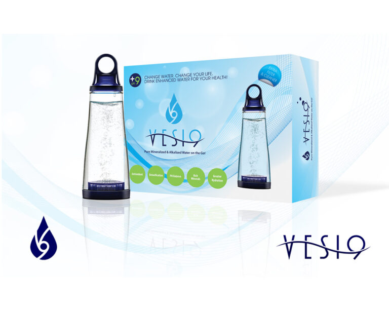
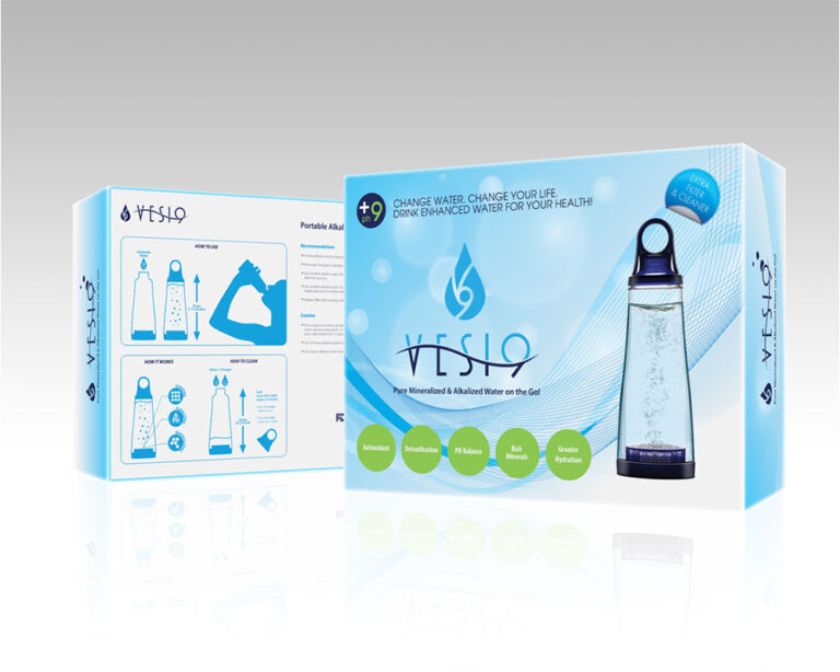
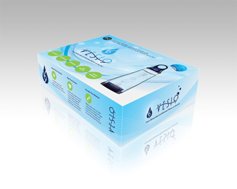
VESI 9 is a portable alkaline water bottle designed to transform drinking water into a balanced pH 9 state using a built-in mineral filtration stone housed at the base of the bottle.
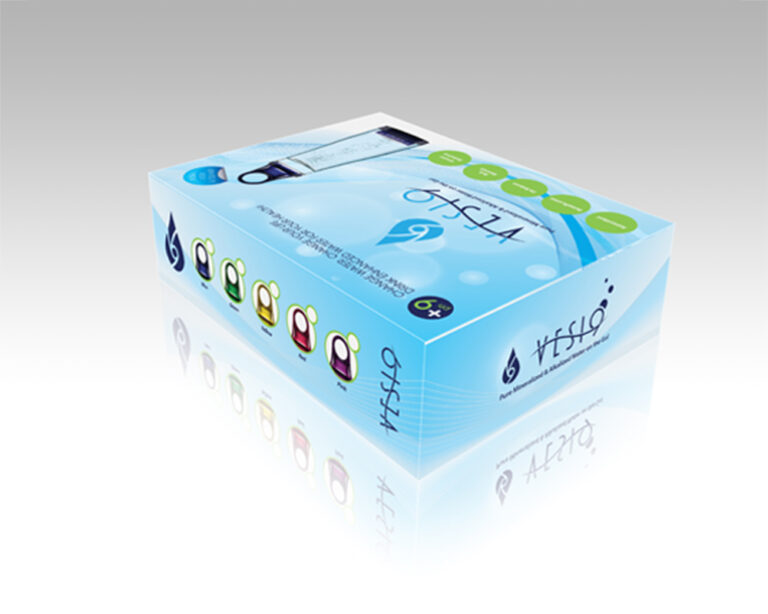
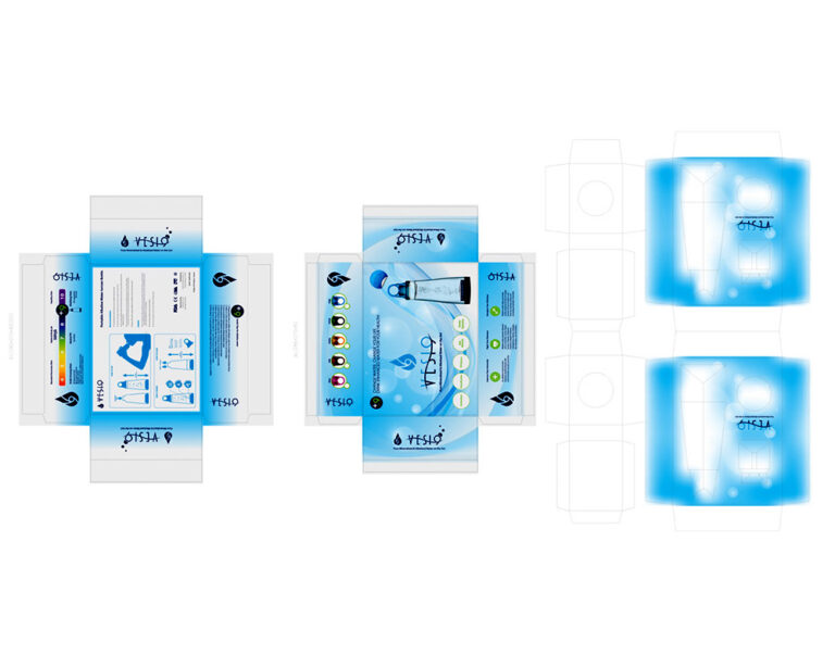
I developed the complete brand identity and multi-component box system for this product, translating its functional innovation into a clear, retail-ready design language.
The system was designed to accommodate six color variations of the bottle using a modular paper-based packaging structure, combining an outer box with an internal protective insert to ensure stability during transport and visual consistency across the product line.