Branding & Identity Design

Brand systems built for clarity, consistency, and long-term growth.

Brand Identity Visual Systems Art Direction Packaging Digital Brands Retail
I design brand identity systems (branding identity design), not just visuals, so they scale across products, platforms, and time.

WHAT THIS CATEGORY INCLUDES

This branding identity design category showcases identity systems built for real-world use:
logos, brand marks, and foundational visuals designed to scale
across digital, print, and physical environments.

SELECTED LOGOS

Case Study 01

LOGO CONCEPT & VISUAL DEVELOPMENT

Health to Perform (HTP)

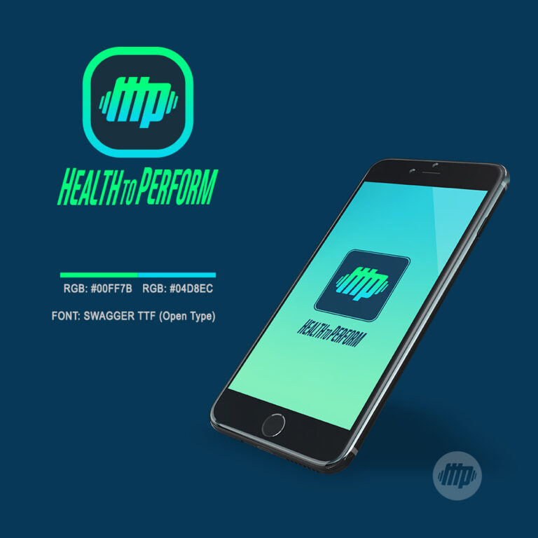
Health to Perform (HTP) is a mobile application designed to connect youth athletes with parents, coaches, and recruiters through a shared performance-focused platform.

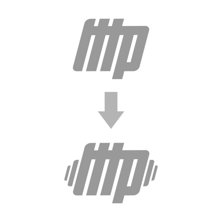
The identity needed to feel energetic, supportive, and performance-driven—without leaning too aggressively into traditional sports branding. The logo concept was developed around movement, momentum, and physical engagement, translating athletic effort into a simple, recognizable visual mark that works across digital interfaces and app environments.

Branding identity design portfolio showcasing logo and brand systems by Jay Lee

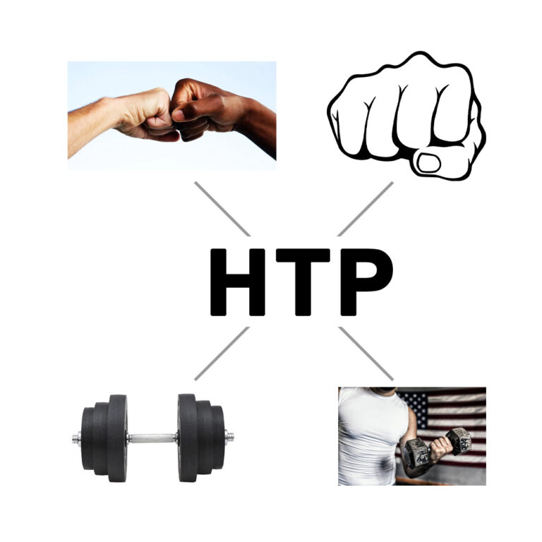
Design Inspiration: Fist Bump

A fist bump (also known as power five, PIB as in pound it bro, or pibbys) is a gesture similar in meaning to a handshake or high five. A fist bump can also be a symbol of giving respect or approval. It can be followed by various other hand and body gestures and may be part of a dap greeting. It is commonly used in baseball and hockey as a form of celebration with teammates, and with opposition players at the end of a game. In cricket it is a common celebratory gesture between batting partners.

hpt inspiration
hpt inspiration 07
hpt inspiration 01

Rather than a full brand system, this project focused on creating a flexible logo and visual language optimized for mobile use, scalability, and instant recognition within a product ecosystem.

This approach is ideal for early-stage products and digital platforms.

hpt inspiration 06

Case Study 02

Full Brand Identity System

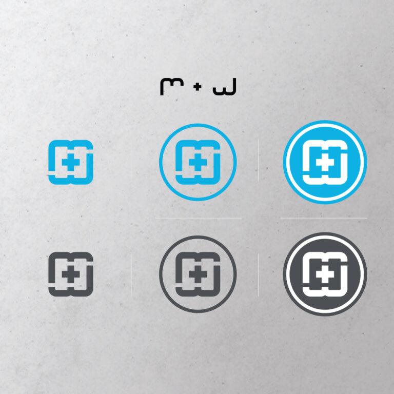
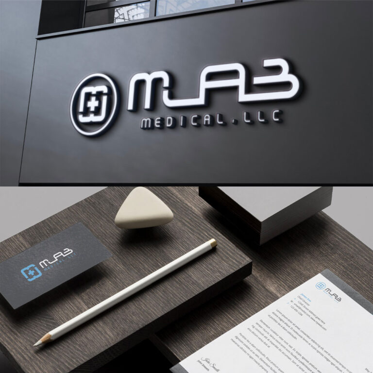
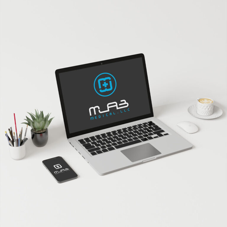
MLAB MEDICAL

MLAB Medical is a Las Vegas–based medical supplier serving clients nationwide across the United States.

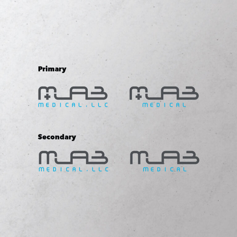
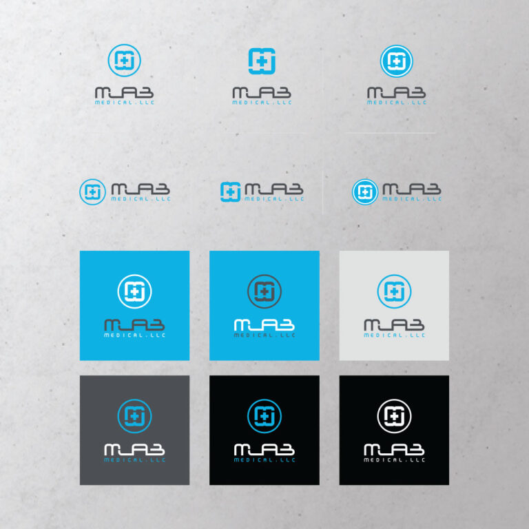
The project focused on building a complete brand identity system—from logo design to structured brand guidelines—designed to support consistency, credibility, and real-world business operations.

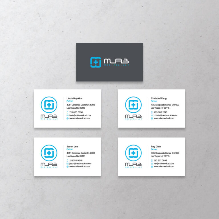
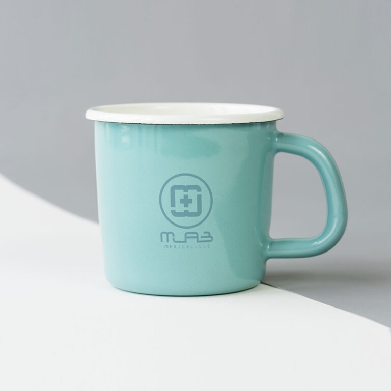
This work extended beyond visual identity into practical applications, including business cards, corporate stationery, and branded documents used in day-to-day operations. The result is a clear, scalable brand system built to perform across digital, print, and operational touchpoints.

mlab 01
mlab 02
mlab 03
mlab 04
mlab 05
mlab 06
mlab 07
mlab 09
mlab 10
mlab 08

A complete brand system built to support real-world operations—
designed for clarity, consistency, and long-term growth across every touchpoint.

If you’re building a brand that needs to perform beyond visuals,
let’s design a system that scales with your business.